12.1-Graphical Representation of Data
12.1-Graphical Representation of Data Important Formulae
You are currently studying
Grade 9 → Math → Statistics → 12.1-Graphical Representation of Data
- Draw a bar graph.
- Draw a histogram.
- Draw a frequency polygon.
12.1 Graphical Representation of Data
Graphical representation of data is a crucial method for visualizing information. It helps in interpreting data trends, comparisons, and patterns effectively. This section discusses three key types of graphical representations: Bar Graphs, Histograms, and Frequency Polygons.
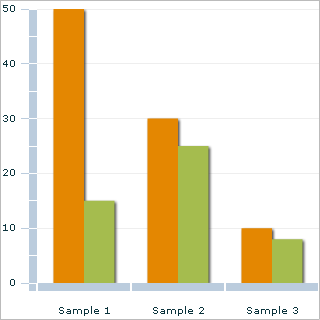
A. Bar Graphs
Bar graphs are used to represent categorical data. Each category is represented by a bar, where the height or length of the bar corresponds to the value it represents. Key features of bar graphs include:
- Bars can be vertical or horizontal.
- Bars are of equal width and spaced evenly.
- The length of the bar is proportional to the quantity it represents.
To construct a bar graph:
- Identify the categories to be represented.
- Determine the scale based on the highest value in the data.
- Draw the bars for each category based on their values.
Example: If we have data on the number of students in different clubs, a bar graph can visually compare the number of members in each club.
B. Histograms
Histograms are similar to bar graphs but are used for continuous data. Instead of distinct categories, histograms represent data grouped into intervals or "bins." Key features include:
- Bins must be of equal width.
- There are no gaps between the bars, reflecting the continuous nature of the data.
To create a histogram:
- Collect data and create intervals.
- Count the frequency of data points within each interval.
- Draw bars for each interval based on the frequency.
Example: A histogram showing the distribution of students' scores in an exam can reveal how many students fall within specific score ranges.
C. Frequency Polygon
A frequency polygon is a graphical representation of the distribution of a dataset. It is created by plotting points corresponding to the frequency of each class interval and connecting them with straight lines. Key aspects include:
- It provides a visual representation of the distribution shape.
- It is more effective for displaying trends over time.
To construct a frequency polygon:
- Create a frequency table with class intervals and their frequencies.
- Determine the midpoints of each interval.
- Plot points at the midpoints, corresponding to their frequencies.
- Connect the points with straight lines.
Example: A frequency polygon can be used to illustrate the changes in student enrollment over several years.
All these graphical methods are essential for summarizing large datasets, allowing for quick analysis and better understanding of trends. Bar graphs are suitable for categorical data, histograms for continuous data, and frequency polygons for visualizing frequency distributions. Understanding when to use each type of graph is vital for effective data analysis.
???? ??????????? at uk.wikipedia, CC BY-SA 3.0, via Wikimedia Commons

JLW87, Public domain, via Wikimedia Commons